DISH NETWORK
Evolving a Fortune 250 Company
In 2019, Dish began making some bold moves in the marketplace. They have a storied history of thinking long-term and building on capabilities. As the mission evolved from video to Smart Home and 5G wireless, so did the brand. They needed a clean, modern look to connect diverse capabilities and drive innovation across an enterprise gearing up for the future. This was developed completely in-house from strategic brand architecture studies to full identity and system development.
Read the story +
The Wordmark
Our new wordmark is a modern evolution of the Dish logo for a new unified brand. The new mark is bolder, creating a stronger presence with rounded corners that soften the design and make it more approachable. The weight and spacing have also been balanced for better legibility and clarity.
The Beacon Icon
This icon is the secondary mark for Dish. It embodies the origin of the enterprise and represents the satellite television side of the business. There are three “Beacon” waves, one for DISH, Sling, and OnTech Smart Services.
The Brand Site
Taking inspiration from Starbucks and Dropbox, we created a site specifically for Dish design, functionality, and digital features.
The Brand Book
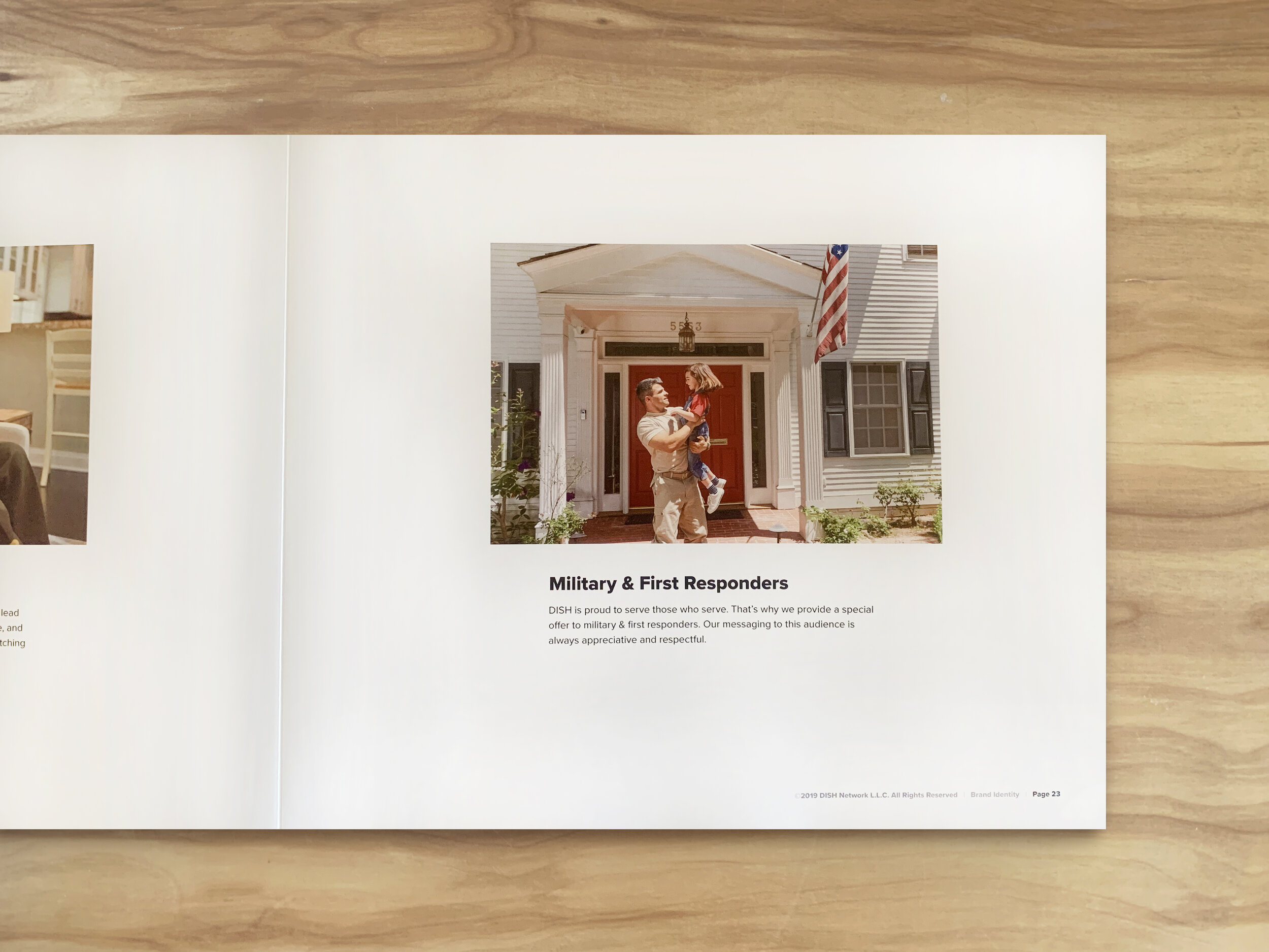
A beautiful yet functional flat lay brand book design for the Dish brand guidelines 2019. This book provides guidance on how to properly use logos, fonts, typography, color, trademarks, photography, products, and much more.
Credits
Agency: OneTen Creative
Creative Director: Michael Sizemore
Account Director: Joel Huerta
Art Director: Jessica Bell
Designer: Lauren Cutler
Motion Graphics: Travis Hess
Digital: John Lindmark, Jon Traister
Copywriter: Cory Voyzey
Project Manager: Shawna Basta


