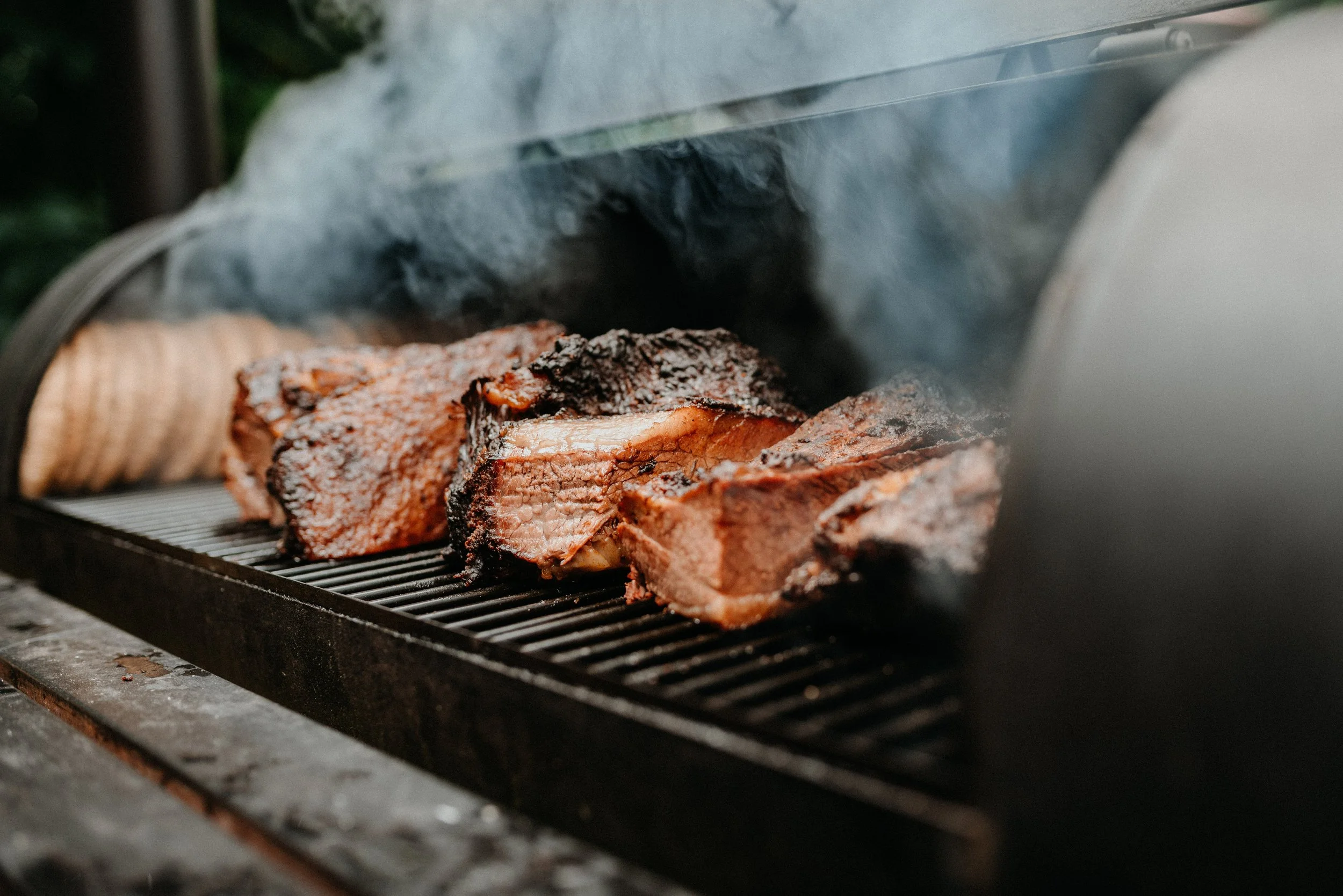
Smoked with Science
Milford Brinkerhoff tasked me with creating a BBQ brand identity that was as bold and inventive as he is. On shelves crowded with lookalike products, he needed something unmistakably original—something that would grab attention, stick in customers’ minds, and reflect his “mad scientist” meets “innovative chef” personality.
The challenge? His brand name was long, and every design decision had to make it easy to read, easy to remember, and impossible to ignore. My solution paired a vibrant, high-contrast color palette with a detailed illustrated portrait of Milford himself, building instant recognition and a personal connection.
To tie everything together, I used his existing real estate company logo as a foundation—creating a subtle but intentional link between his two ventures. The result: a BBQ brand that feels daring, cohesive, and entirely his own.
SERVICES PROVIDED
Brand Identity
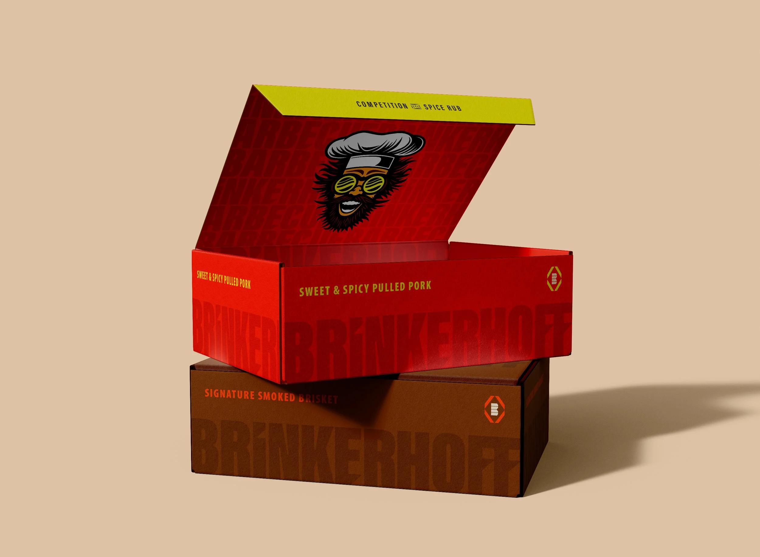
Packaging
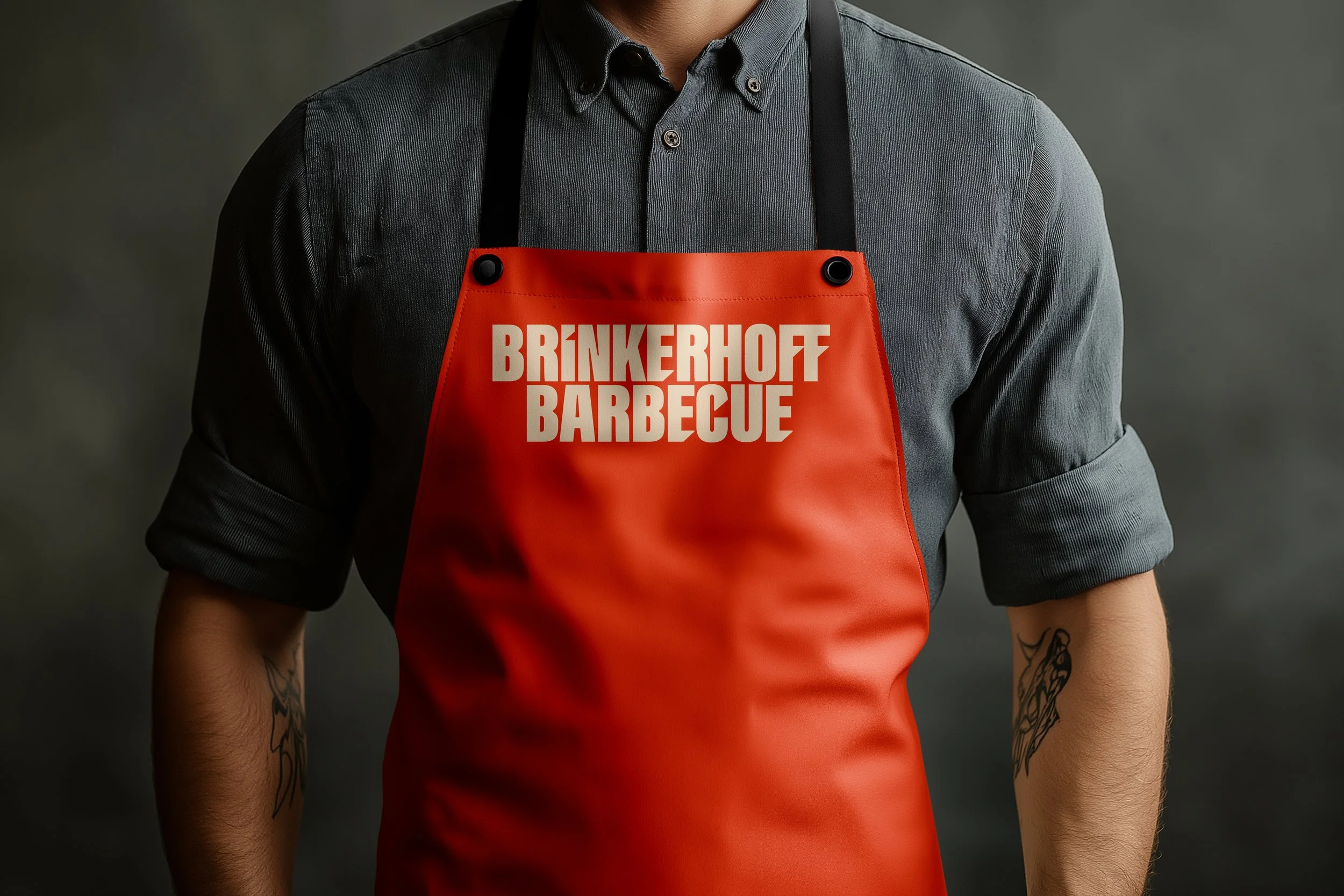
Apparel
Illustration
Typography


Bold Letters,
Bigger Flavor
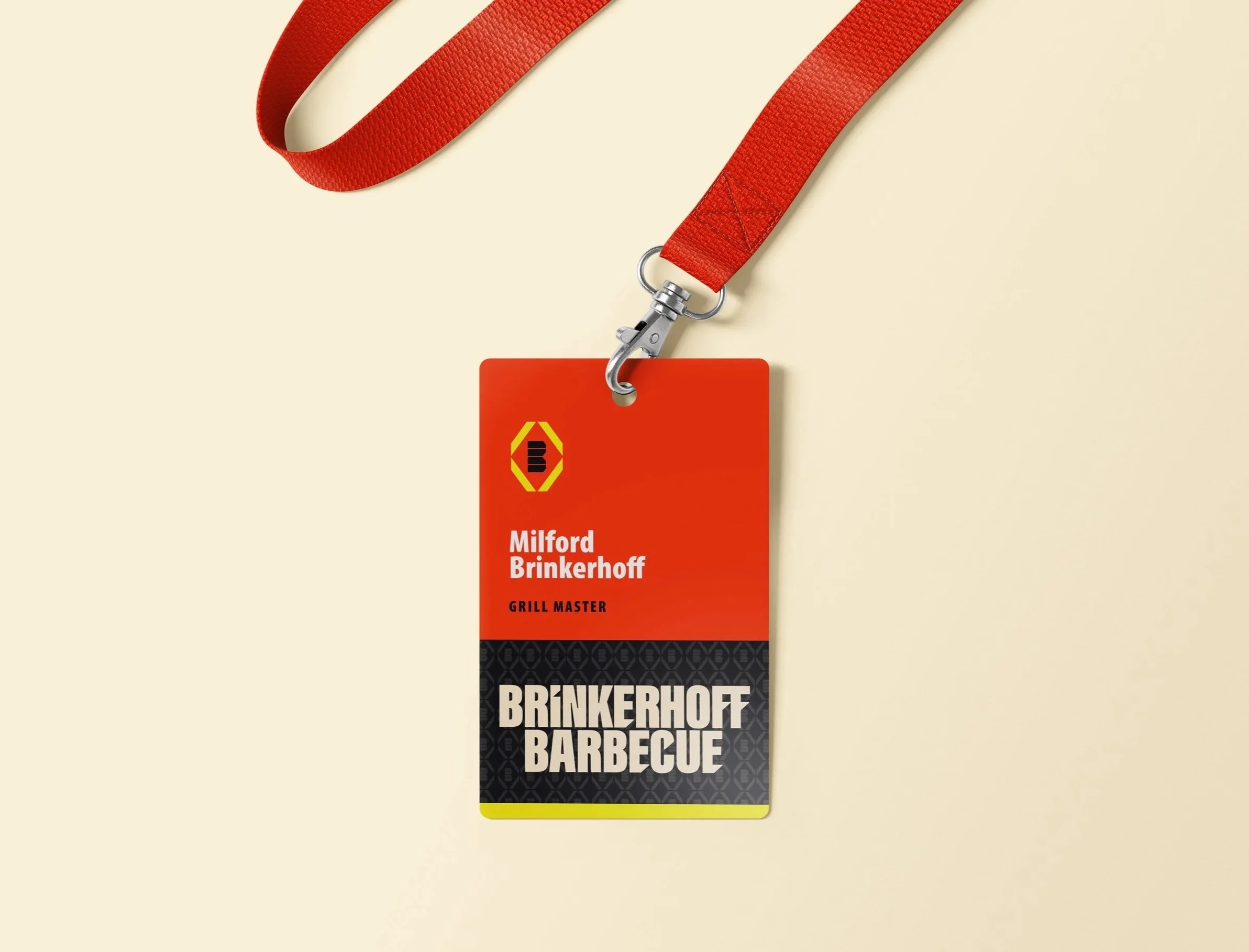
When I set out to design the Brinkerhoff Barbecue brand, I started somewhere unexpected—Milford Brinkerhoff’s real estate logo. I used it as a foundation so both of his businesses would feel visually connected. Even though real estate and BBQ spice rubs have nothing in common on paper, Milford’s worlds naturally overlap. He meets new clients at grill-offs and competitions, and when he’s showing properties, BBQ becomes the perfect icebreaker. More than once, a house sale has ended with a handshake, a smile, and a jar of his signature spice rub as a thank-you gift.
I created a bold, geometric “B” icon with yellow bars that call to mind grill slats and perfect char marks. The angular red frame ties back to the strength and confidence of his real estate branding. For the typography, I custom designed an all-caps, heavy-weight typeface to evoke bold flavor and give the brand a masculine, competitive edge that fits both industries.
In the end, I built a visual identity that makes Milford stand out—not just from other spice makers, but from other real estate agents too. His brand tells one seamless story: whether you’re firing up the smoker or closing on your dream home, he delivers with personality, skill, and a memorable brand experience.
From Coop to Pasture
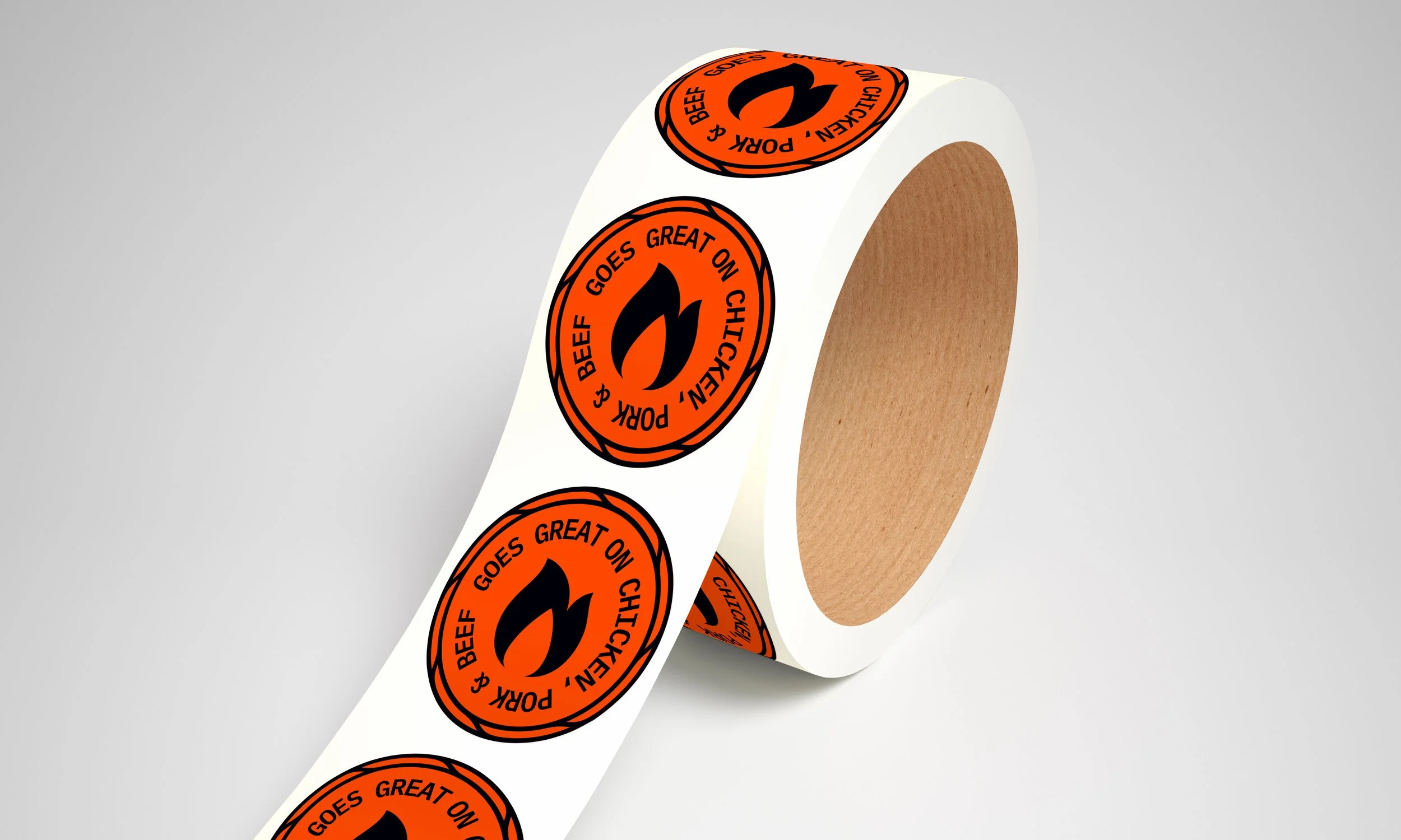
To build out the visual language beyond the primary logo, I designed this supporting graphic featuring the 3 proteins the rub pairs best with—chicken, pork, and beef.
The proportions of the animals are intentionally exaggerated—stacked like building blocks rather than true to scale. This lighthearted approach signals that the brand doesn’t take itself too seriously. Barbecue is about more than just cooking; it’s about gathering with friends and family, sharing food, and creating memories. The playful sizing captures that spirit, making the design approachable, fun, and unmistakably tied to the joy of eating together.


Grill-ready Identity
The final brand system delivers a bold, colorful identity that commands attention on the shelf and online. By moving away from a muted, black-and-white look to something vibrant and eye-catching, the brand now stands apart from its competitors and draws customers in at a glance.
The result is more than just packaging—it’s a memorable presence that resonates across social media, strengthens engagement, and gives the product the personality it deserves.