Branding the Next Frontier
Launching the Abundance Institute, Utah State University needed a brand that could make frontier technology approachable, inspiring, and trustworthy. Innovation can feel intimidating, and without a clear identity, the Institute risked losing the attention of the students, educators, and innovators it aimed to engage.
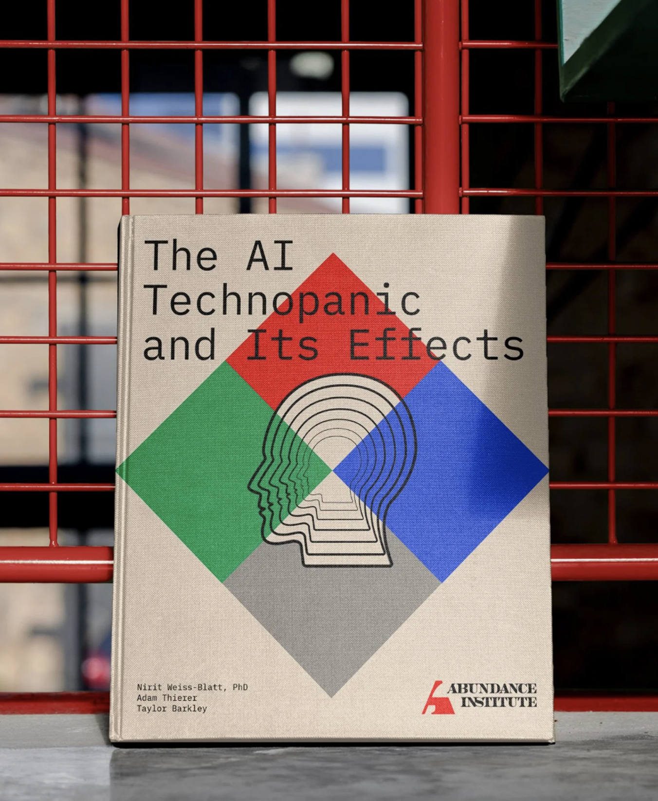
Slash Agency in Denver led the holistic brand-building process and brought me on board to help develop the Institute’s visual identity. I designed the logo, created a custom typographic system, and expanded the identity across all brand touchpoints. This included the website, social media campaigns, stationery, business cards, and branded apparel. While motion design was handled by others, I collaborated closely to ensure a cohesive and consistent visual language.
From the start, the process was collaborative and adaptive. The team prioritized efficiency and flexibility, working with the Institute to define the brief, focus on the essentials first, and integrate feedback seamlessly as the brand evolved. I was involved throughout, helping translate the vision into tangible design while maintaining the flexibility needed for a fast-moving, early-stage launch.
The result was a cohesive, compelling brand that positioned the Abundance Institute as a trusted leader in technology education. The identity and digital presence gave them credibility and clarity, while the supporting collateral and branded items reinforced their message. Together, these elements helped the Institute engage its audience, foster community, and spark conversations about the future of technology with confidence.
SERVICES PROVIDED
Art Direction
Brand Identity
Illustration
Stationery
Typography
Website Design


The Shape of Innovation
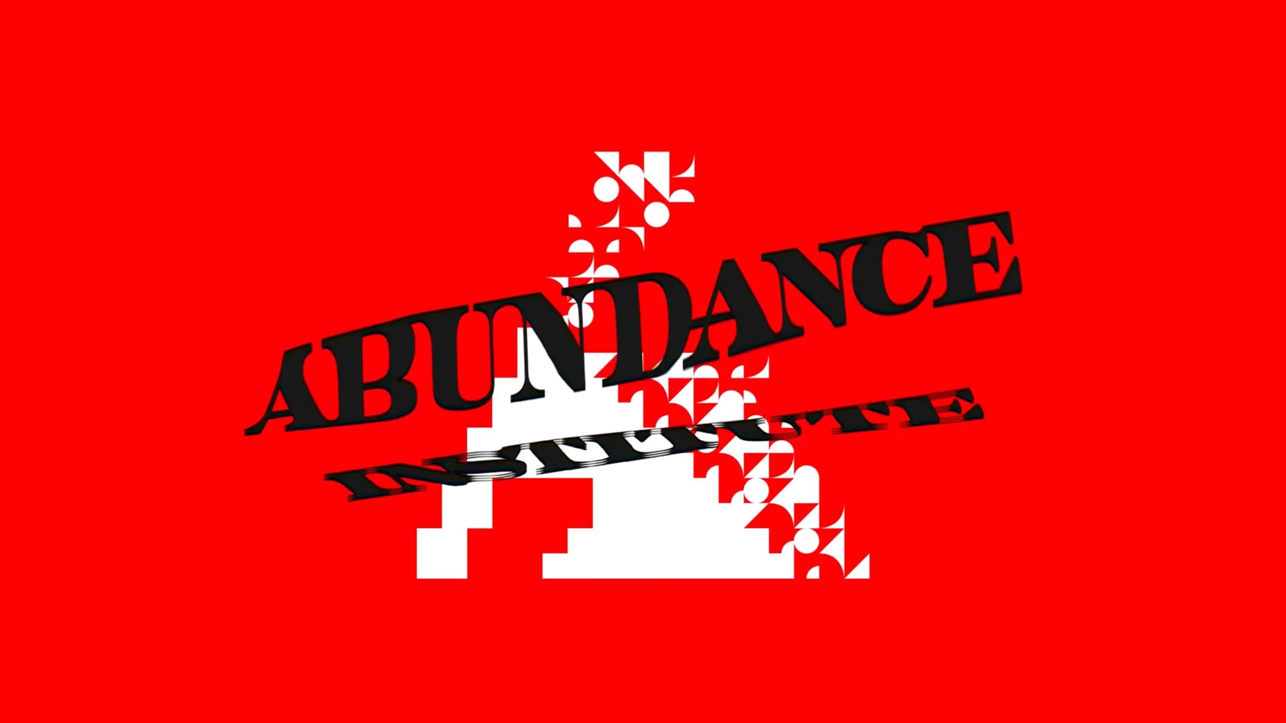
The Abundance Institute needed a mark that could capture the balance between innovation and credibility—a brand that feels forward-looking and creative while still grounded in trust and academic authority.
The resulting logo centers on a bold, custom “A” that immediately distinguishes the brand. The form is dynamic and contemporary, yet the weight and geometry give it a sense of stability. It feels approachable and relatable, while also signaling the Institute’s role as a serious educational authority.
Pairing this mark with strong, custom typography creates a cohesive identity that is both expressive and established. The sharp, refined letterforms reinforce credibility, while the inventive “A” adds an element of creativity and originality, perfectly embodying the Institute’s mission to make frontier technology accessible and inspiring.
This logo became the cornerstone of the Abundance Institute’s identity system, setting the tone for the website, campaigns, and all other branded applications.


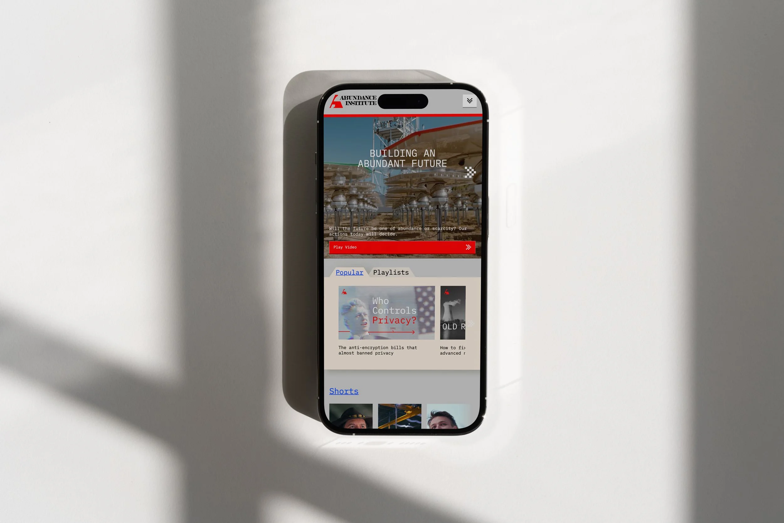
Proof in Positivity
We built a digital home that blends optimism with authority, where storytelling takes every form: video, editorial, policy framing, and founder voice. A custom SLASH-built CMS gave the team control without compromising the brand’s original style.


Designed to be Relatable
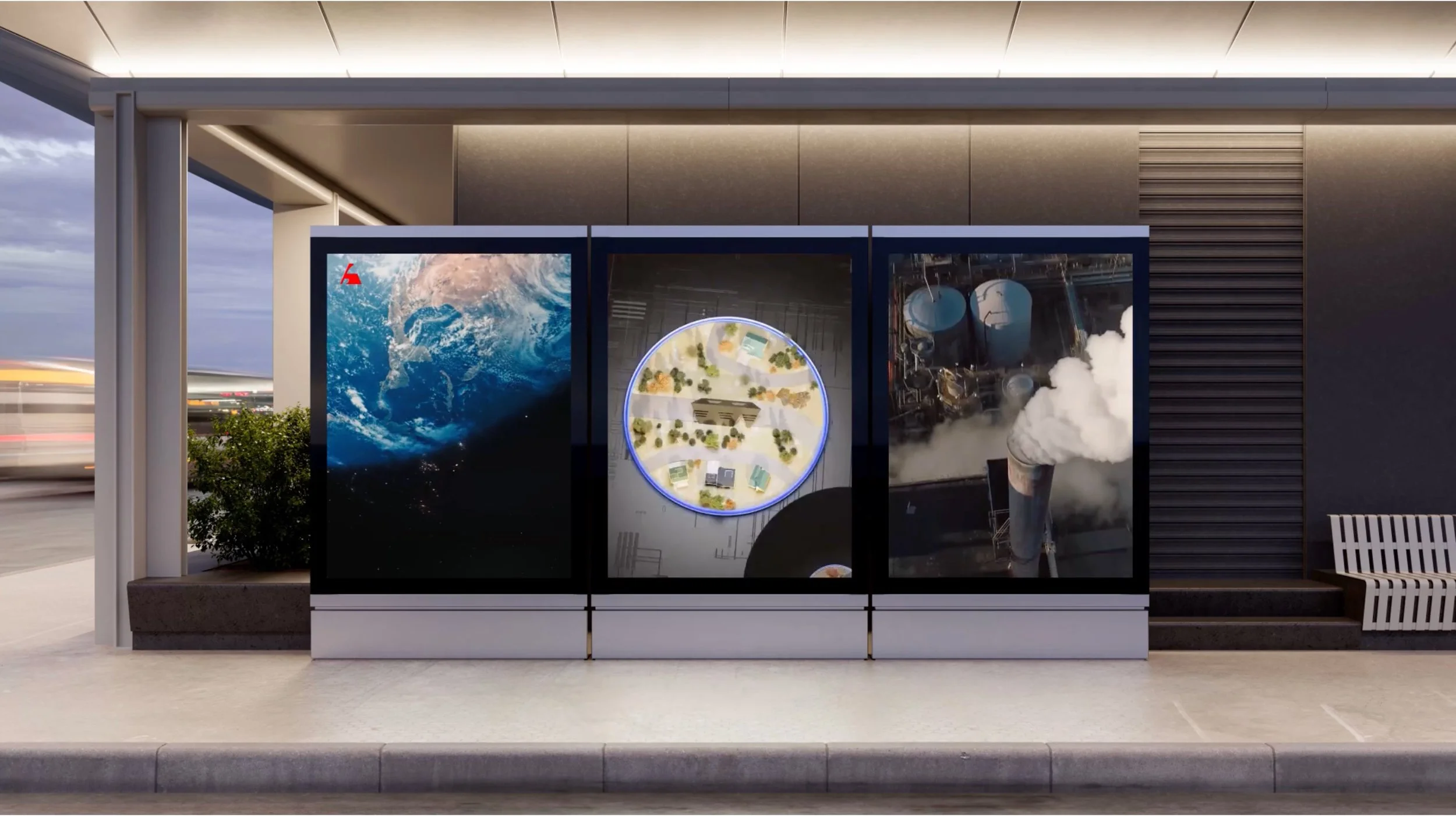
To complement the Abundance Institute’s brand identity, I created a set of custom icons inspired by 1990s 8-bit graphics. The client wanted a system that felt both nostalgic and approachable, while still being on-trend and relevant to a forward-thinking audience. The pixelated style not only taps into a collective sense of familiarity and playfulness but also bridges the gap between past and future—making innovation feel more human, accessible, and relatable. These icons became a versatile part of the brand toolkit, used across digital and social platforms to add personality and a distinctive visual voice.


Pixels With Purpose
To complement the Abundance Institute’s brand identity, I created a set of custom icons inspired by 1990s 8-bit graphics. The client wanted a system that felt both nostalgic and approachable, while still being on-trend and relevant to a forward-thinking audience. The pixelated style not only taps into a collective sense of familiarity and playfulness but also bridges the gap between past and future—making innovation feel more human, accessible, and relatable. These icons became a versatile part of the brand toolkit, used across digital and social platforms to add personality and a distinctive visual voice.